
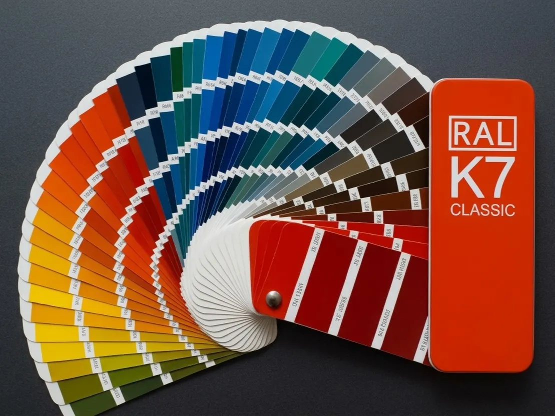
Choosing colour and texture in powder coating is much more than aesthetics. In industry, construction or furniture manufacturing, the right shade affects the product's durability, its UV resistance, compliance with safety standards and the brand's corporate style.
In this article we explain how to choose colours and textures of powder coatings depending on the specifics of your industry.
1. Architecture and construction: reliability and UV resistance
For façade systems, aluminium profiles, fences and outdoor steel structures, the choice of colour is closely linked to the paint's technical properties.
- Popular choices: shades from RAL Classic (for example anthracite grey RAL 7016, white RAL 9016, chocolate brown RAL 8017) and deep textures (moiré, fine texture).
- What to look out for: For outdoor use it is critical to choose polyester or façade powder paints marked QUALICOAT, which guarantee that the colour will not fade in the sun for decades.
2. Industrial equipment and machine tools: safety and practicality
In mechanical engineering and instrument making, colour serves both a signalling and a practical function.
- Popular choices: standard safety colours (for example bright yellow RAL 1023 or orange RAL 2004 for moving parts and danger zones), as well as dark practical shades (dark grey, graphite) for machine housings, where traces of oil and dust are less visible.
- What to look out for: The coating must withstand technical fluids, vibration and mechanical damage. Textured coatings (“fine texture” type) are often used to hide small metal defects.
3. Automotive and transport: style and a premium effect
Wheels, suspension parts, bull bars and body parts need special attention to the coating effect.
- Popular choices: exclusive effects — metallic, Xirallic, “antique” (copper, bronze, silver), as well as gloss and matt black shades.
- What to look out for: Car parts are constantly exposed to abrasion (stones, sand, de-icing chemicals). What matters here is not only the colour but also a good primer layer and a strong protective clear coat.
4. Furniture, interiors and design: trends and tactile feel
For metal furniture, loft structures, lamps and retail equipment, the tactile feel and harmony with the interior are important.
- Popular choices: pastel tones, deep matt black, white, and textured paints with a velvet or moiré effect.
- What to look out for: Thanks to the wide range of the RAL, NCS and Pantone systems, today you can match a brand's corporate style exactly or create a unique designer texture.
Getting it right: the main criteria
- Use professional colour charts: do not choose a colour from a picture on a screen — always check the shade against a physical fan deck from RAL or NCS.
- Consider the gloss level: gloss, semi-matt or deep matt finishes radically change how the same colour is perceived.
- Order colour samples: before launching a full production run, always ask for a test-coated sample to make sure it meets your expectations.
Conclusions
The right powder coating colour emphasises the status of the product, protects it from aggressive environmental factors and ensures durability. Take the operating conditions and industry standards into account and use proven colour charts.